

UX Design
UI Design
generative ai
Timeline
February - May 2023
Role
Product Designer
Collaboration
Paul Pittman (ex-Amazon), Mentor
Overview
In early 2023, Quora launched Poe on iOS, the first one-stop platform to allow users to interact with multiple AI agents and share conversations with AI like a social network. As users struggle to navigate to key features that set Poe apart, my redesign focuses on making navigation and bot discovery easy, straightforward, and intuitively discoverable.
how might we
How might we redesign to reflect Poe's value proposition, thereby making the platform more inclusive and beginner-friendly?
Solution
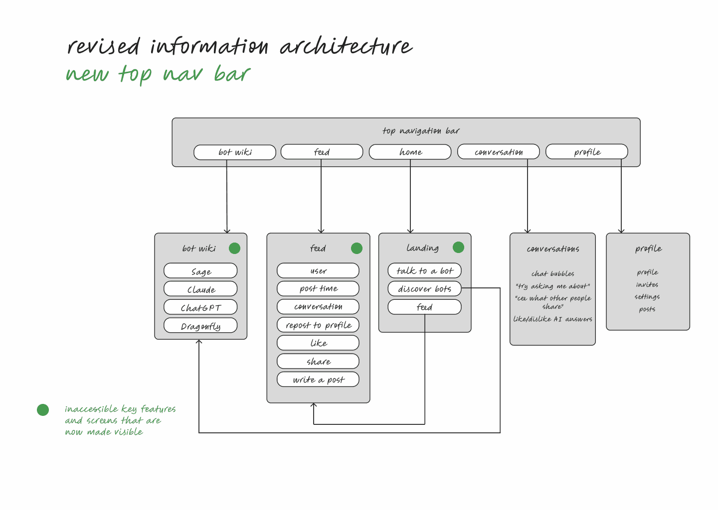
I redesigned Poe with a new information architecture tailored to beginners, making navigation straightforward and key features discoverable.
problem statement
solution
Before
Selling points hidden under hamburger menu; Bot information not visible
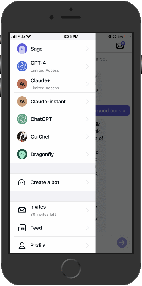
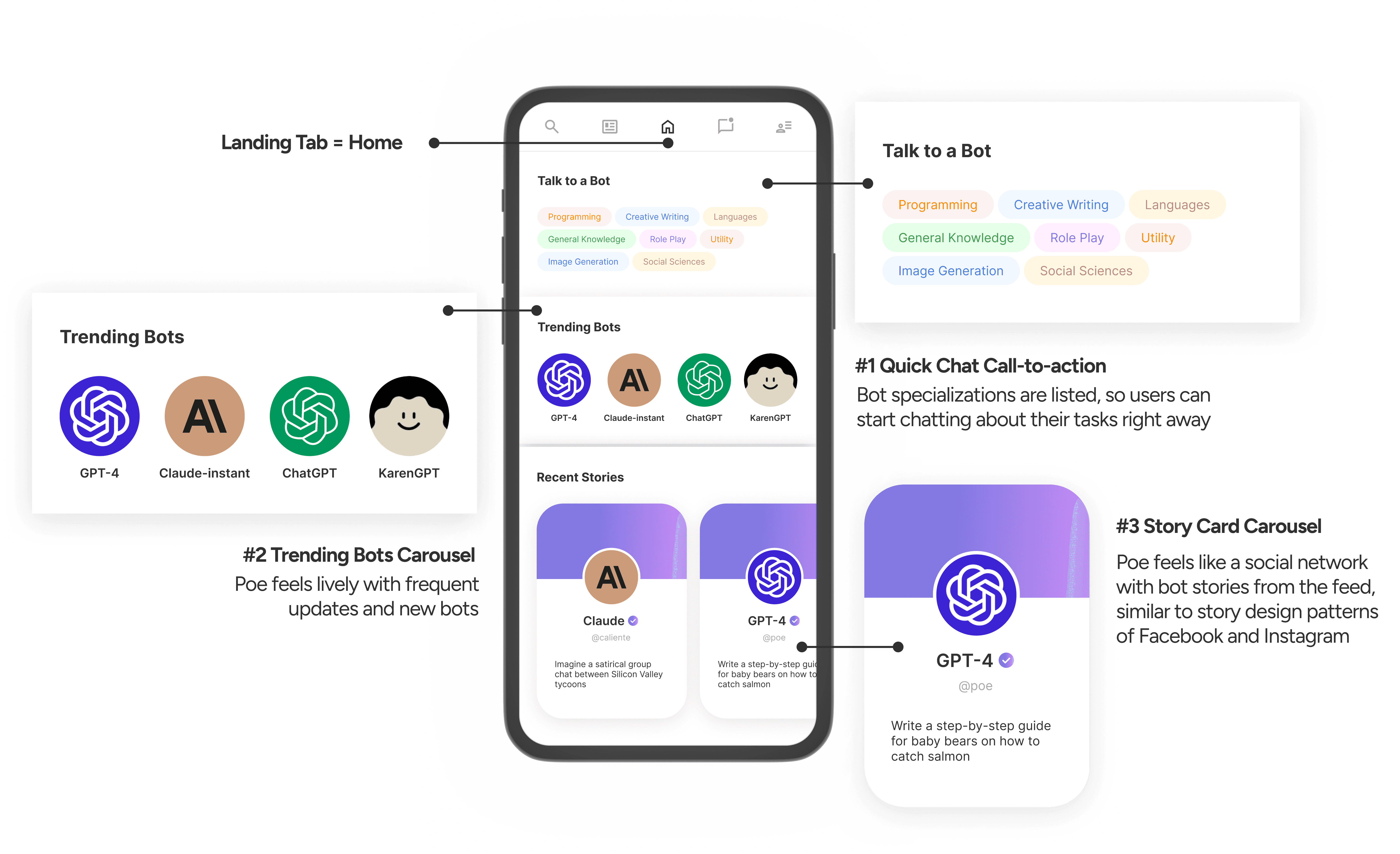
After
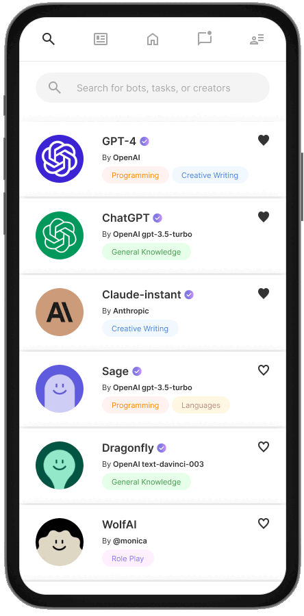
product context
Poe's selling point
💬 Multi-bot platform — Poe is the first to offer multiple AI bots in one place.
🌐 Community feed — Poe allows users to share dialogues with different AI bots on a community feed.
Why does this matter?
🗝️ Users get the best answers to their questions, because different bots are specialized in different tasks.
🗝️ The social aspect of the app allows users to share and learn AI use cases together on the community feed.
what does this mean for ux?
💡 We must ensure users can easily learn about each bot's specializations.
💡 We must ensure users understand the value of the feed in learning and sharing AI use cases.
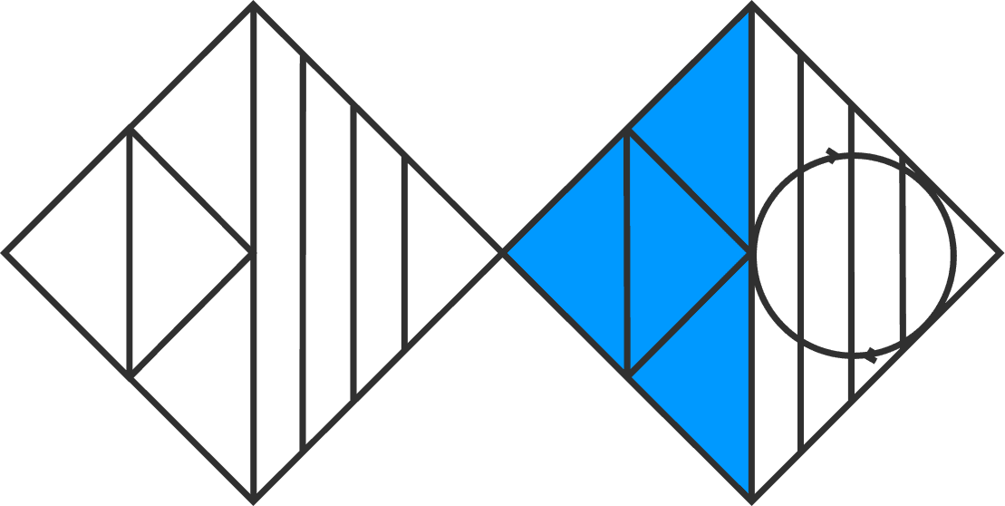
DESIGN PROCESS
In the span of 12 weeks of the project, I followed the Double Diamond process. It offers the perfect balance divergent and convergent thinking, allowing a deep exploration of possibilities and then narrowing down ideas to stay laser-focused on the best solution.
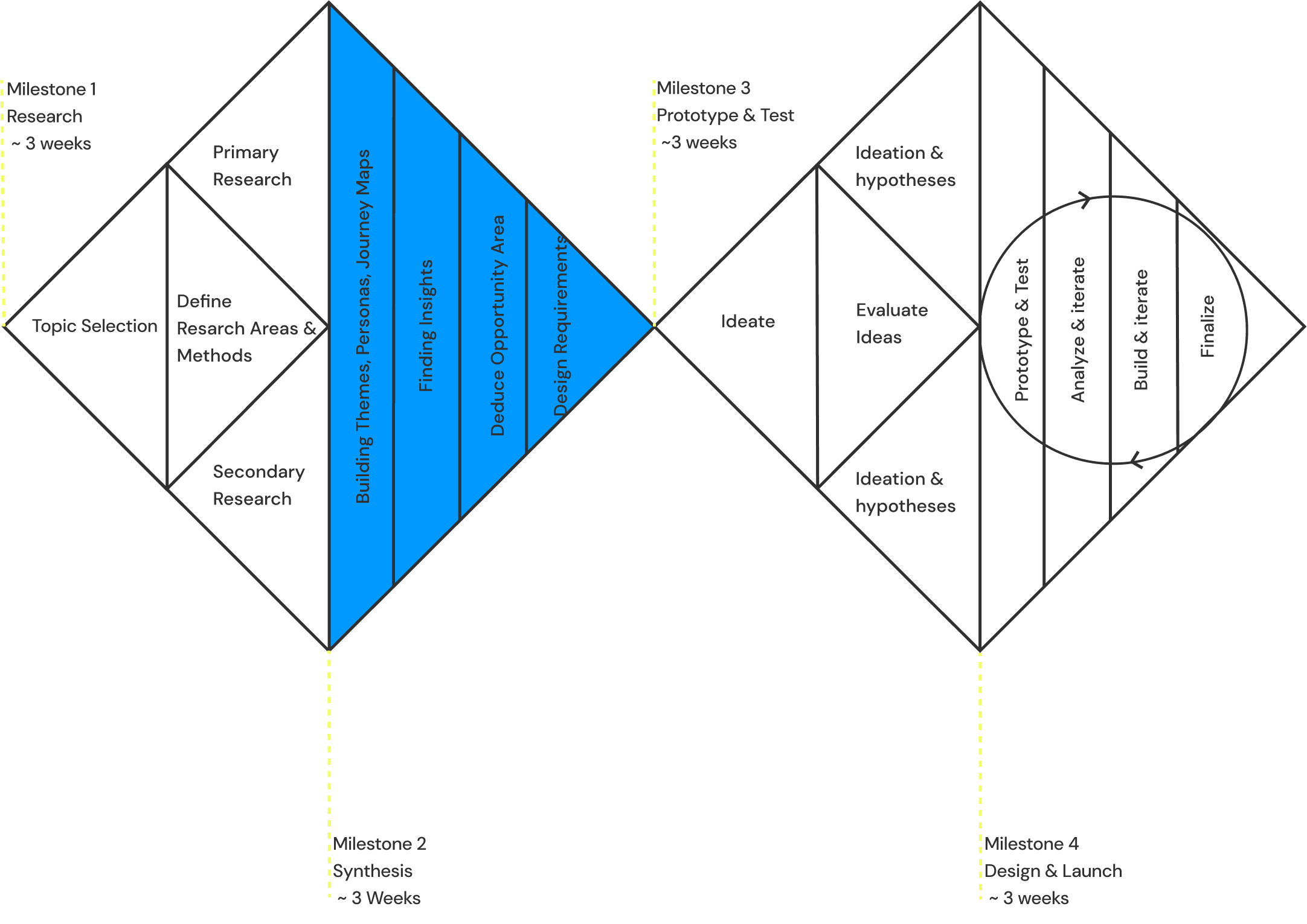
RESEARCH

Market Analysis
While companies like OpenAI, Anthropic, and Google develop AI models such as ChatGPT, Claude, and Bard, Quora has introduced Poe as the first AI marketplace and social network. Poe's strengths lie in its integration of multiple AI models and a community-driven space that encourages knowledge-sharing.

research takeaway #1
User Segmentation
I set out to interview users of varying levels of tech-savvyness, AI literacy, and desired task. Through 10 user interviews, I categorized users into 3 segments to determine the focus of redesign efforts.
😎
😎
The Expert User (20%)
Highly knowledgeable about Poe and experienced with AI products
😎 Experiences little to no friction in utilizing AI bots or the feed
📖 AI Literacy: High
🔎 Product Familiarity: High
💼 Desired Task: Work
😐
😐
The Casual User (20%)
Curious and fickle, questioning Poe's functions and usefulness
😐 Experiences moderate friction in utilizing AI bots or the feed
📖 AI Literacy: Low - Moderate
🔎 Product Familiarity: Low - Moderate
💼 Desired Task: None, just browsing
👼👼👼
👼👼👼
The Beginner User (60%)
Newcomers to AI/Poe, requiring guidance to navigate the platform
👼 Experiences the most friction and the steepest learning curve
📖 AI Literacy: Low - Moderate
🔎 Product Familiarity: Low
💼 Desired Task: Work
research takeaway #2
💡 60% of Poe's current users are Beginners. For successful product adoption and reduced churn rate, we need to resolve their current pain points through easy navigation and clear information architecture.
💡 AI moves so fast that users can easily revert to their steep learning curve. It is strategic to prioritize design for Beginners first, ensuring the product is inclusive and accessible to users of all literacy levels at all times.
While Expert Users (20%) and Casual Users (20%) have little to no struggle with understanding Poe, Beginner Users (60%) struggle the most with navigation and learning core functions of the app. I created an affinity map to group beginner users' pain points into 2 themes.

zooming into beginner users
research takeaway #3
💡 Missing value proposition. Users do not know what tasks each AI chatbot is optimized for.
💡 Difficult navigation. Users struggle to navigate to or entirely miss the community feed.
SYNTHESIS

I finalized the HMW statement and synthesized research findings that resulted in redesign action items.
How Might We Statement
how might we statement
sub-questions
💬 How might we make it easier for users to learn about each bot's specialized knowledge?
🌐 How might we make the community feed more discoverable?
Synthesis for Redesign

synthesis outcome
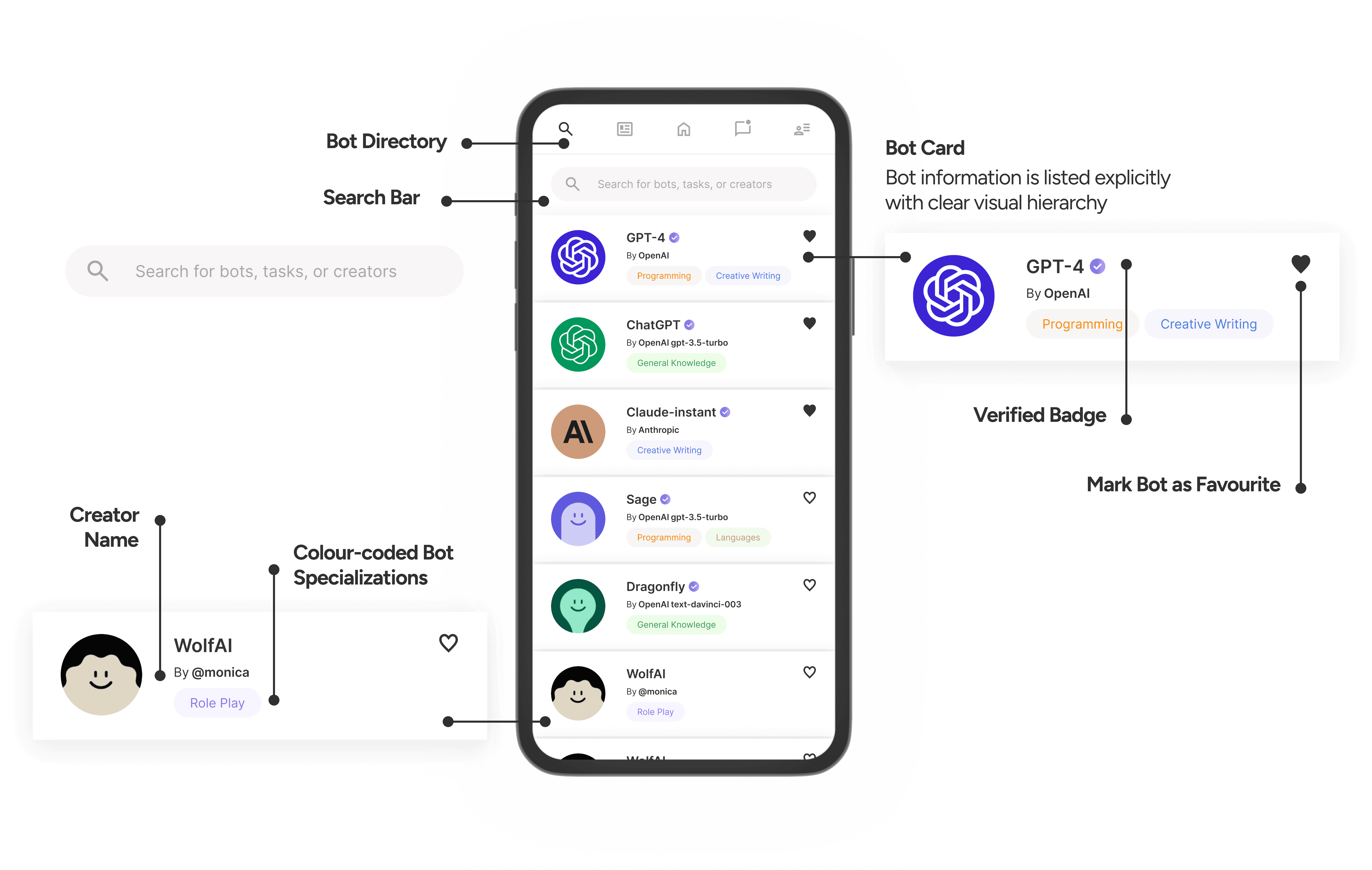
💡 Bot directory — a single source of truth where users can learn about each bot (company, model name, history, specializations, etc.)
💡 New information architecture — a flat app hierarchy that ensures navigation to key functions are easy and explicit, with no features buried deep under the hamburger menu.
PROTOTYPING
With user research insights, I started ideating the final redesign.
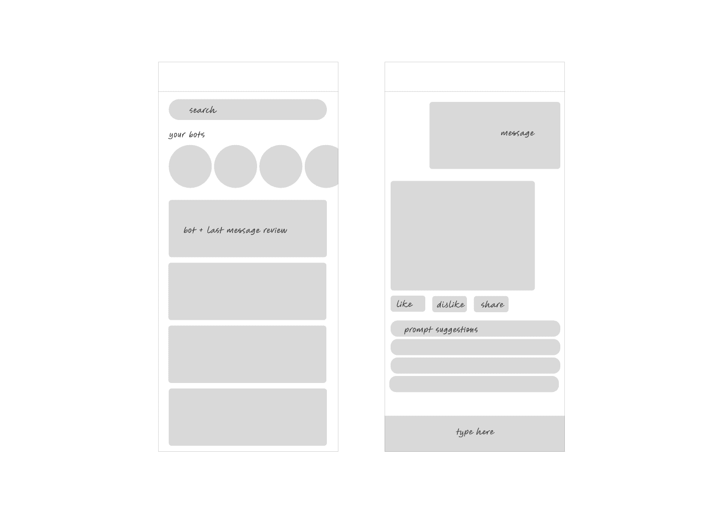
Bot directory
Exploring how to best guide users through each bot’s specialized areas.

Information architecture
Exploring the best way to organize information with a flat app hierarchy. Some ideas have promise.


design


OUTCOMES
What difference did I make?
Users spend
3 seconds
↓ 300%
Users spend
↓ 200%
Satisfaction rate
80%
↑ 20%
of interviewed users are satisfied with the AI bot they choose
Although this is an unsolicited design, I have spoken to several data scientists and engineers to align with the technical requirements of the project. I also embrace building in public by launching this redesign to a community of supportive tech friends.
REFLECTION
What did I learn?
Make a conscious effort to understand the technical domain of a product.
I dove head first into the world of generative AI consumer products by reading and going on 1:1s with AI/ML engineers to ensure that the redesign brings out Poe’s best features.
Define the scope of design carefully.
Prioritizing features that are important to the business helps me narrow the focus to 2 key themes instead of attempting to fix everything. With this comes the understanding that a design is always a work in progress while we should still do our best to improve in every iteration.